ShopDreamUp AI ArtDreamUp
Deviation Actions


Description
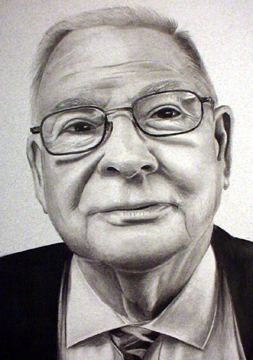
This is the 5th drawing in my "Heros of the Faith" series. This will be a series of 7-10 men who have devoted their lives to ministry.
This drawing is 10x14 and is done with black charcoal on a smooth granite paper.
**I'm not sure this is done yet. I always add the white charcoal, but I wanted to get some feedback on it with only black. Also, I am using a different paper this time. It is very smoothe and is easier to draw on, but it is very unforgiving.
Let me know what you think. Photo stinks, but you must realize that my new Indian name is "Chief Bad Light King"
Image size
354x504px 228.77 KB
Make
SONY
Model
FDMAVICA
Shutter Speed
10/50 second
Aperture
F/3.8
Focal Length
6 mm
ISO Speed
100
Date Taken
Mar 9, 2004, 5:28:58 PM
© 2004 - 2024 crimmy
Comments51
Join the community to add your comment. Already a deviant? Log In
That looks so incredibly real.... You have much talent